The dining room is more than just a place to eat—it’s a space for gathering, conversation, and creating lasting memories. Whether you want to make a bold statement or create a subtle ambiance, choosing the right colors can elevate your dining room’s drama and appeal. In this guide, we’ll explore some of the best dining room colors and tips on how to incorporate them.
Choosing a Color Palette for Your Dining Room
Color helps set the mood and atmosphere of any room, especially in dining spaces. The right color palette can create a cohesive and inviting dining room. Consider your home’s overall style and the atmosphere you want to create when choosing. Here are two main approaches to color selection:
Warm vs. Cool Colors
Warm colors, such as reds, oranges, and yellows, can create a cozy and energetic atmosphere. These hues are perfect for dining rooms where you want to encourage lively conversation and create a welcoming environment. They’re known to stimulate appetite and encourage social interaction, making them popular choices for dining rooms.
Cool colors such as blues, greens, and purples can create a calming atmosphere, perfect for more intimate or formal dining experiences. They provide a sense of calm and sophistication and are a good choice for a more relaxed ambiance.
Monochromatic vs. Complementary Schemes
A monochromatic color scheme uses various shades and tints of a single color, creating a harmonious and elegant look. This approach can add depth and interest to your dining room without overwhelming the space. Complementary color schemes use colors opposite each other on the color wheel. This creates a bold and dynamic look that can add excitement to your dining area.
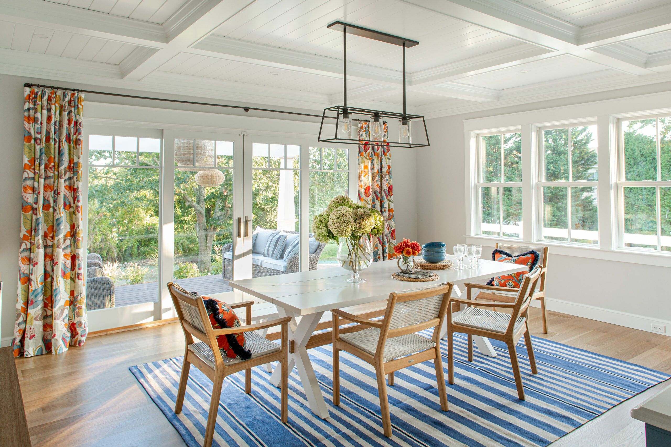
You could use various shades of blue in your dining room to create a calming, sophisticated, and stylish monochromatic look. For a complementary color scheme, you could paint your dining room blue and incorporate pops of bright orange and yellow, which are across the color wheel from blue. The contrast creates a bolder look with more visual interest.
Bold and Dramatic Color Options
Bold colors can make a statement and transform your dining room into a showstopping space. Here are some dramatic options to consider.
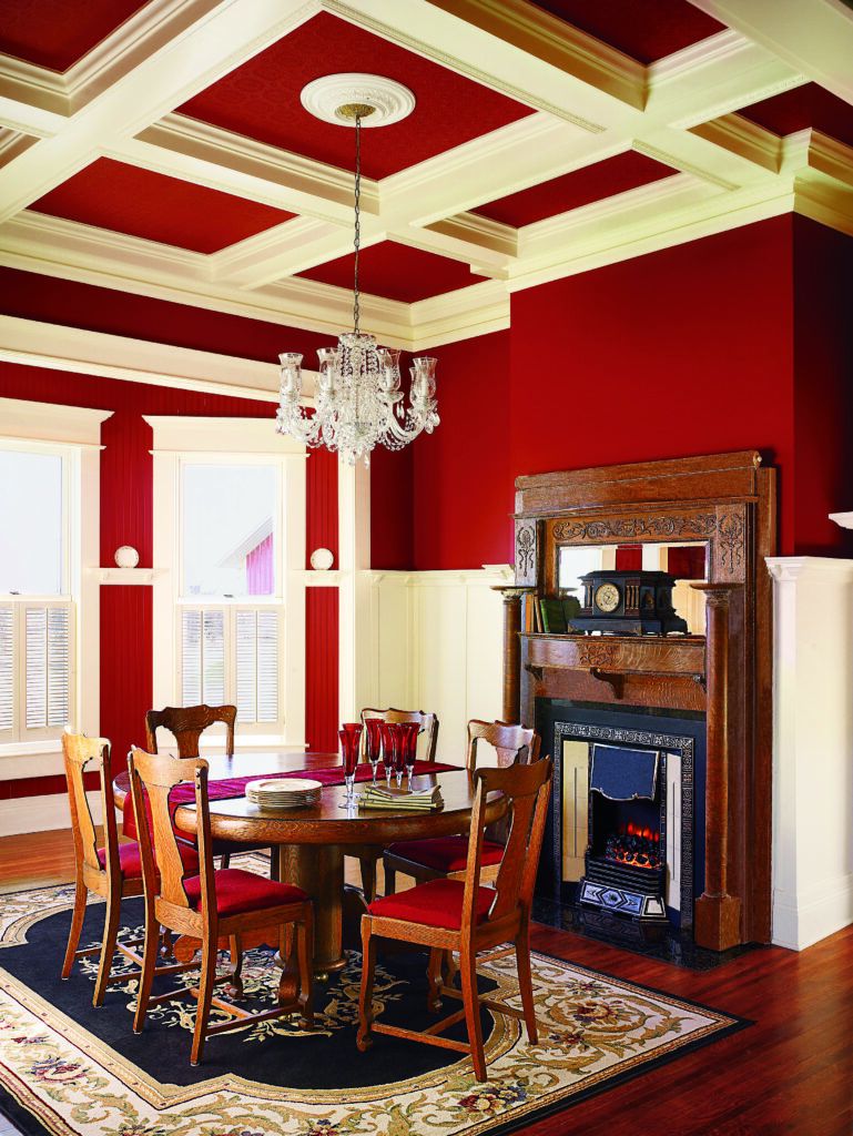
Deep Reds and Burgundies
Rich, deep reds and burgundies can create a sense of luxury and warmth in your dining room. These colors can complement a wide range of decor styles, from traditional to modern. Balance deep reds with neutral accents to prevent the space from feeling overwhelming.
Rich Navy Blue
Navy blue is a versatile color that can add depth and sophistication to your dining room. It pairs beautifully with metallic accents and warm wood tones, creating a luxurious and inviting space. Navy walls can make a striking backdrop for artwork and provide a cozy feel during evening meals.
Emerald Green
Emerald green is a bold choice that can bring life and energy to your dining room. This rich hue works well with both modern and traditional decor, adding a touch of elegance and nature-inspired beauty. Pair emerald green with gold accents for a truly opulent look.
Neutral Colors for Your Dining Room That Pack a Punch
Neutral colors don’t have to be boring. When used strategically, they can create a dramatic and sophisticated dining room. Here are some popular options for your space.
Charcoal Gray
Charcoal gray is a modern and versatile neutral that can add depth and drama to your dining space. It provides an excellent backdrop for colorful artwork and can make white trim and moldings pop. Pair charcoal gray with metallic accents for a sleek, contemporary look.
Crisp White
A crisp white dining room can be stunning in its simplicity. White walls create a blank canvas that allows your furniture and decor to take center stage. To add visual interest, incorporate texture through wallpaper, wainscoting, or textured paint techniques. White also reflects light, making your dining room feel more spacious and airy.
Warm Taupe
Taupe is a sophisticated neutral that can add warmth and elegance to your dining room. This versatile color works well with both cool and warm accent colors, allowing you to change your decor seasonally without repainting.
Accent Colors for Your Dining Room to Enhance Drama
Accent colors can add depth and interest to your dining room, creating focal points and tying the space together. Here are some ways to incorporate accent colors.
Metallic Accents
Metallic accents like gold, silver, or copper can add a touch of glamour to your dining room. Use metallic finishes on light fixtures, mirror frames, or decorative objects to create visual interest and reflect light throughout the space. These accents work particularly well with deep, rich wall colors.
Jewel Tones
Jewel tones such as sapphire blue, amethyst purple, or ruby red can make your dining room feel more luxurious. Apply these colors in smaller doses through upholstery, curtains, or artwork to create eye-catching focal points without overwhelming the space.
Incorporating Color Through Furniture and Decor
Furniture and decor offer opportunities to introduce color without committing to painted walls.
Colorful Dining Chairs
Dining chairs in bold colors or patterns can add personality and visual interest to your dining room. Mix and match chair colors for an eclectic look, or choose a single vibrant hue to contrast a neutral table and walls.
Statement Rugs
A colorful area rug can anchor your dining table and add warmth to the room. Choose a rug with a bold pattern or rich hues to create a focal point and tie your color scheme together. For a balanced look, select a rug that extends at least 24 inches beyond the table on all sides.
Wall Art and Accessories
Artwork, curtains, and decorative accessories offer easy ways to introduce color into your dining room. Large-scale art pieces can be a focal point, while smaller accessories like vases, table runners, and placemats allow you to change your color scheme seasonally.
Lighting Considerations for Color Enhancement
Proper lighting can dramatically affect how colors appear in your dining room.
Natural Light
The amount and quality of natural light in your dining room can influence your color choices. North-facing rooms tend to have cooler light, which can make warm colors appear muted. South-facing rooms receive warmer light, enhancing the richness of warm hues. Consider testing paint colors at different times of day to see how they look in various lighting conditions.
Artificial Lighting Options
The type of artificial lighting you choose can also impact color perception. Warm white bulbs enhance warm colors, while cool white bulbs can make cool colors appear more vibrant. Dimmer switches allow you to adjust the lighting mood for different occasions.
Paint Techniques To Add Visual Interest
Unique paint techniques can add depth and texture to your dining room walls. Here are two popular methods.
Color Blocking
Color blocking involves painting geometric shapes or sections of your wall in different colors. This technique can create a modern, artistic look and allows you to incorporate multiple colors without overwhelming the space. Use painter’s tape to create clean lines between colors.
Ombre Effects
An ombre effect gradually transitions from one color to another, creating a soft, dreamy look. This technique works well with both bold and neutral color palettes and can make your dining room feel more spacious. To achieve this effect, blend two or more shades of the same color family.
How To Test Colors Before Committing To a Dining Room Color

Before painting your dining room, test colors in the space. Purchase sample pots of your chosen colors and paint large swatches on your walls. Observe how the colors look at different times of day and under various lighting conditions. You can also use house paint apps to virtually test colors in your space before making a decision.
Avoiding Common Color Mistakes in Dining Rooms
To create a successful color scheme, avoid these common mistakes:
- Choosing colors that clash with your home’s overall style
- Failing to consider the visual flow between adjacent rooms
- Ignoring the impact of natural and artificial lighting
- Overlooking the importance of testing colors before committing
- Using too many bold colors without balance
Seasonal Color Changes for Dining Spaces
Keep your dining room fresh and exciting by incorporating seasonal color changes. Use accessories like table linens, centerpieces, and artwork to reflect the changing seasons. For example, apply warm oranges and deep reds for fall, cool blues and silvers for winter, pastel hues for spring, and bright, vibrant colors for summer.
Color Trends for Dramatic Dining Rooms
While classic colors always have their place, staying aware of current trends can inspire fresh ideas for your dining room. Some current color trends for dramatic dining spaces include the following:
- Black and white combinations for high contrast
- Moody dark greens and blues
- Nature-inspired greens paired with natural wood tones
- Soft, muted pastels for a subtle dramatic effect
- Warm earth tones like terracotta and ochre
Our Conclusion
Painting your dining room is an exciting way to express your style and set the right atmosphere for meals. Whether you opt for bold, saturated hues or sophisticated neutrals, the key is to choose colors that resonate with you and complement your home’s overall aesthetic.
Remember that lighting, furniture, and decor all play a role in bringing your color scheme to life. Don’t be afraid to experiment with different combinations and techniques to find the perfect balance for your space. With the right colors, your dining room can become a stunning centerpiece of your home.