Start with stone
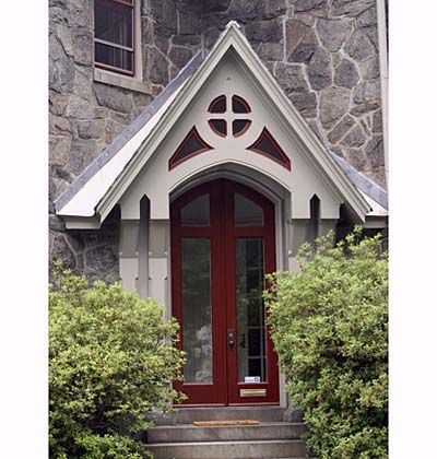
Exterior paint schemes should be based on colors that are already established. For this Gothic-style entry, those were the grays of the stone and roof. Too much gray can seem dismal, so the perfect counterpoint was a warm, rich color: burgundy red. To allow it to accent the doors and windows, other surfaces were painted off-white and a shade of gray slightly lighter than the stone.
Safe and sane
Here’s one approach that never fails: Pick a light shade of a neutral color for the walls so your house looks lighthearted, not dark and foreboding. Use white for window trim and other details that are part of the structure, such as barge boards on the roof edge. White looks clean and fresh, and around windows it helps reflect more light indoors. Paint add-on features, such as shutters, a dark color so they work as accents.
Tone it down
When you want to give a building a lively look, one trick that always works is to choose colors that are opposite each other on a color wheel. Green and red are one such pair. However, using pure green and pure red would result in a garish, Christmas look. Adding similar amounts of gray to both colors tones down the effect, creating a look that fits a vintage house.
Singing the blues
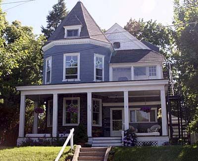
Blue is a daring color to use on an exterior because it isn’t rooted in an earth color, but grayish shades like this are safer because they somewhat resemble colors of slate. Indoors, blue creates a cool feel in a room. On an exterior, however, the psychological effect is less pronounced. Combined with white, and surrounded with greenery, it looks crisp and calm.
Black is beautiful
An all-black house would look sinister. But when you use this color as an accent, it’s more like a black bow tie: the perfect finishing touch. Besides using pure black this way, you can also use very dark shades of other colors. Extremely dark green, for example, “reads” as black and yet adds a bit of mystery that pure black lacks. Try using the darkest shade of whatever color you choose for walls. Creamy white is a great third color.
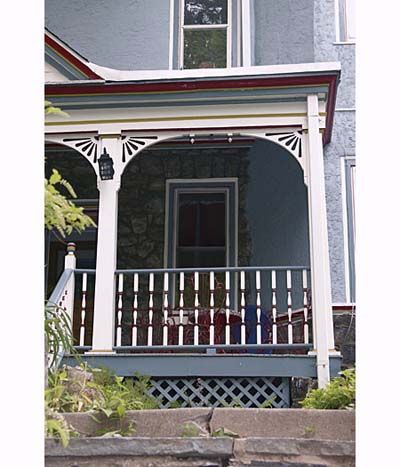
Free to flaunt
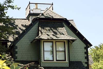
Like a dress that shows off a woman’s best features, paint should play up beautiful architectural features. For the best effect, establish a clear hierarchy of which color goes where. Here, the green extends over all walls that aren’t stone, including the half-wall around the second-floor porch and the base of the bay window. The innermost trim pieces are white; the rest of the trim is red.
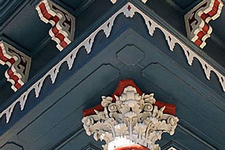
Victorian beauty
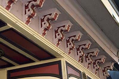
In the Victorian age, if one detail would do, two was considered better. That’s why lavish detail often adorns houses of the era. Paint schemes with several colors and sharp contrasts play up these architectural features. The more detail, the bolder you can be, as seen here. The extremely ornate corbels show sharp contrast between light and dark colors, while the less detailed panels underneath are painted in two dark colors.
Rouge and lipstick
The Queen Anne architectural style developed in the 1880s and 1890s, when builders were just gaining access to a flood of factory-made house parts. Like children who’ve just been introduced to candy, they made lavish use of ornate fretwork and turned balusters, sometimes with little thought of which details were stylisticly in synch. Paint schemes can be just as exhuberant, for Queen Annes are the “painted ladies” of the Victorian era.
Stick to lines
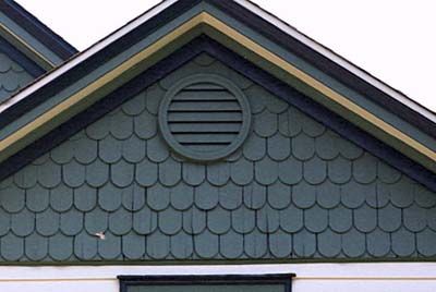
You may long for a color scheme that highlights every architectural detail, but detailing paint this way is costly because all of the details need to be brushed on by hand. It’s cheaper to have the paint sprayed on, but then large expanses need to be all one color. One good compromise: Use a single color for walls and anything embedded in them, such as vents. Then indulge in detailed colors on the ends of the eves.
Wood wonder
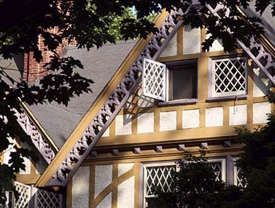
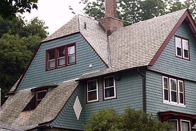
Half-timbered construction developed in Medieval times, when builders framed houses with heavy timbers and then filled in between them with thin strips of wood covered by plaster. Painting the timbers a shade of brown, even tan, works well because it is true to the roots of this architectural detail.
Good matches
Monochromatic paint schemes, which are based on a single color, gain all of their contrast by adding various amounts of black or white to a single base color. The limited contrast looks calm and safe—too staid for some tastes. The antidote, as shown here, is to insert a little of the complimentary color, which lies opposite on a color wheel. With green, that makes red the perfect accent.
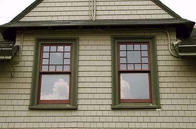
Ephemeral pleasure
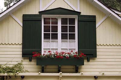
One reason it’s so difficult to settle on exterior colors is that you know you will be looking at the results day in and day out for years. However, you can still vary the look of your house from season to season. Red geraniums add a bright note to this gable end. When they die off, it might be time for a banner or other decoration.